React for Data Visualization (with D3) - workshop by Swizec
reactd3workshop.com
Intro to D3
You can read this segment in in 9 minutes. Solving the exercises might take longer.
This segment covers 👇
Welcome to the Dataviz section. 📈
You know all about React, Redux, and building apps out of components. Yesterday we talked about thinking in state machines, designing a good architecture, and built a gif watching app.
Today we're going to use those skills to build a data visualization.
But first you need to learn about D3, the undisputed champion of data visualization libraries.
Why D3
Because D3 can do all of this 👇
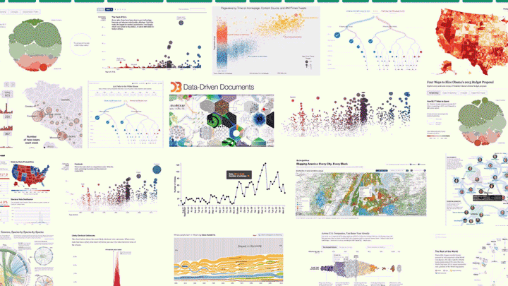
D3 is the best library out there for custom data visualization. It comes with a rich ecosystem of functions for almost anything you can think of. From simple medians, to automatic axis generators, and force diagrams.
Most data visualization you see on the web is built with D3. The New York Times uses it, Guardian uses it, r/dataisbeautiful is full of it.
Learning D3 from scratch is where life gets tricky.
There are a few gotchas that trip you up and make examples look like magic. You've probably noticed this, if you ever looked at an example project built with D3. They're full of spaghetti code, global variables, and often aren't made to be maintainable.
Most examples are just one-off toys after all. It's art.
A lot of dataviz that isn't art, is charts and graphs. You'll often find that using D3 to build those, is too complicated. D3 gives you more power than you need.
If you want charts, I suggest using a charting library. Vx.js is a great choice.
Where many charting libraries fall short is customization. The API is limited, you can't do everything you want, and it gets easier to just build it yourself.
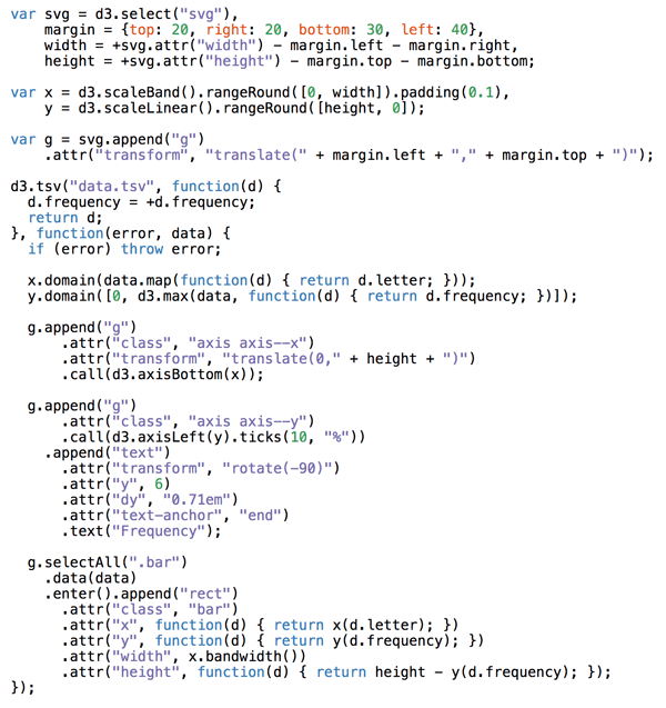
Take this barchart code, for example
d3.tsv(
    "data.tsv",
    function(d) {
        d.frequency = +d.frequency;
        return d;
    },
    function(error, data) {
        if (error) throw error;

        x.domain(
            data.map(function(d) {
                return d.letter;
            })
        );
        y.domain([
            0,
            d3.max(data, function(d) {
                return d.frequency;
            })
        ]);

        g
            .append("g")
            .attr("class", "axis axis--x")
            .attr("transform", "translate(0," + height + ")")
            .call(d3.axisBottom(x));

        g
            .append("g")
            .attr("class", "axis axis--y")
            .call(d3.axisLeft(y).ticks(10, "%"))
            .append("text")
            .attr("transform", "rotate(-90)")
            .attr("y", 6)
            .attr("dy", "0.71em")
            .attr("text-anchor", "end")
            .text("Frequency");

        g
            .selectAll(".bar")
            .data(data)
            .enter()
            .append("rect")
            .attr("class", "bar")
            .attr("x", function(d) {
                return x(d.letter);
            })
            .attr("y", function(d) {
                return y(d.frequency);
            })
            .attr("width", x.bandwidth())
            .attr("height", function(d) {
                return height - y(d.frequency);
            });
    }
);
Can you tell what's going on? I'd need to read it pretty carefully.
3 key insights that help you learn D3.js from scratch
Somebody once asked me how to learn D3.js from scratch. I quipped that it took me writing a book to really learn it. It's one hell of a library.
Most people don't go that far. They don't have to.
You start with a problem, find similar examples, do some copy pasta, tweak until it works and end up with a working visualization you don't understand. You'd be surprised how few people actually understand how their D3 dataviz works.
But there are only 3 key concepts you have to grok, to understand every D3 example out there. 😱
1) Data manipulation vs. DOM manipulation
All D3 examples are split into two parts:
- Data manipulation
- DOM manipulation
First you prep your values, then you render.
You have to go through many examples to notice what's going on. Inference learning is hard. Most beginners miss this pattern and it makes D3 look more confusing than it is.
Let's take an example from D3's docs, a bar chart with a hover effect.
Mike Bostock, the creator of D3, built this chart in 43 lines of code. Here they are 👇
There are two parts to this code: Data manipulation and DOM manipulation.
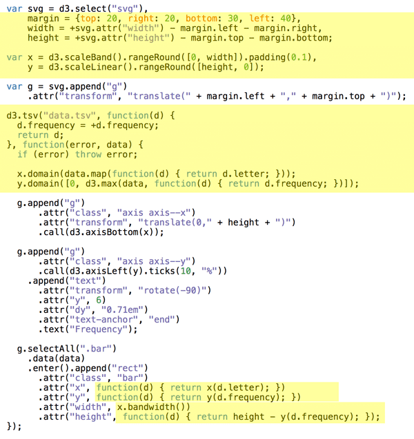
Bostock here first prepares his data:
- some sizing variables (margin, width, height)
- two scales to help with data-to-coordinates conversion (x, y)
- loads his dataset (d3.tsv) and updates his scales' domains
- uses scales to calculate attributes during DOM manipulation
In the DOM manipulation part, he puts shapes and objects into an SVG. This is the part that shows up in your browser.
DOM manipulation in D3 happens via D3 selections. They're a lot like jQuery $(something). Personally I like to do this part with React. That's the approach we're learning today.
Here Bostock does a few things
- selects the
<svg>node (d3.select) - appends a grouping
<g>node (.append) with an SVG positioning attribute (translate) - adds a bottom axis by appending a
<g>, moving it, then callingd3.axisBottomon it. D3 has built-in axis generators - adds a left axis using the same approach but rotating the ticks
- appends a text label "Frequency" to the left axis
- uses
selectAll.datato make a virtual selection of.barnodes and attach some data, then for every new data value (.enter), appends a<rect>node and gives it attributes
That last part is where people get lost. It looks like magic. I've been using D3 for years and it still looks like magic.
It's a declarative approach to rendering data. Works great, hard to understand. That's why I do it in React instead :)
You can think of .enter as a loop over your data and everything chained after .enter is your loop's body. Sort of like doing data.map(d => append(rect).setManyAttributes())
Savvy?
2) Scales
Scales are D3's most versatile concept. They help you translate between two different spaces. Like, mathematical spaces.
They're like the mathematical functions you learned about in school. A domain maps to a range using some sort of formula.

Colored shapes in the domain map to colors in the range. No formula for this one, which makes it an ordinal scale.
let shapes = d3.scaleOrdinal()
	.domain(["triangle", "rectangle", ...])
	.range(['red', 'orange', ...)
Play with scales on CodeSandbox
Once you have this scale, you can use it to translate from shapes to colors. shapes('triangle') returns 'red' for example.
Many different types of scales exist. Linear, logarithmic, quantize, etc. Any basic transformation you can think of exists. The rest you can create by writing custom scales.
You're most often going to use scales to turn your data values into coordinates. But other use cases exist.
3) D3 layouts
Sure .enter.append looks like magic, but D3 layouts are the real mind=blown of the D3 ecosystem. They take your input data and return a full-featured visualization thing.
For example, a force layout using forces between nodes to place them on the screen.
Or a circle packing layout that neatly packs circles.
I don't know the exact maths that goes into most of these. And that's the point, you don't have to.
Here's a key insight about the magic of layouts: They're the data part.
You take a forceLayout and feed it your data. It returns an object with a tick event callback.
var simulation = d3
    .forceSimulation()
    .force(
        "link",
        d3.forceLink().id(function(d) {
            return d.id;
        })
    )
    .force("charge", d3.forceManyBody())
    .force("center", d3.forceCenter(width / 2, height / 2));
This simulation now handles everything about rendering nodes. Changes their positions on every tick callback.
But it is up to you to render them. A layout handles your dataviz in the abstract. You're still in control of rendering.
For a force layout, you have to update the DOM on every tick of the animation. For circle packing, you render it once.
Once I grokked this, all the fancy visualizations out there started making sense. It also means we can use these fancy layouts in React 🙌
Summary
You need to grok 3 key insights for D3 to make sense. Once they click, a whole new world opens up.
- Code is split into data and DOM manipulation
- Scales are great and used a lot
- You're always in control of rendering
A few more cool things D3 can do
Maps
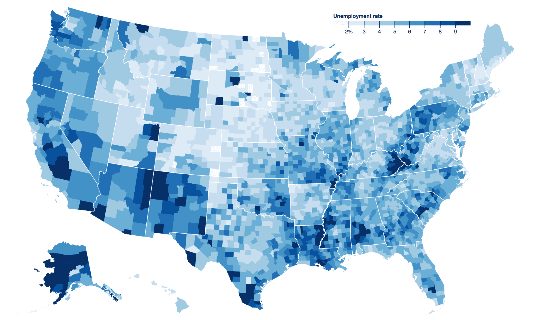
Choropleth map of US unemployment rate.
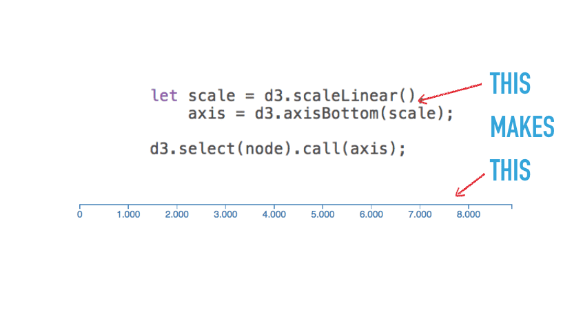
Axes
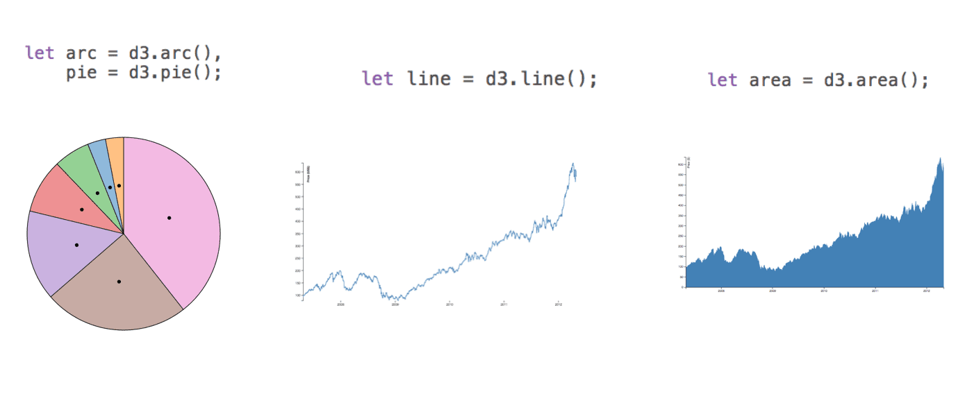
Shapes
- Build the most common thing you need.
- Calculate coordinates.
- You do the rendering.

Transitions

An animated alphabet shows off transitions
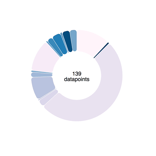
A piechart gets data streamed in every 120ms